Datatel Telecom Churn
I analyzed churn across 6,687 telecom customers to see which groups were leaving at the highest rates. One segment stood out: customers paying for an international plan they never used had about 71% churn.
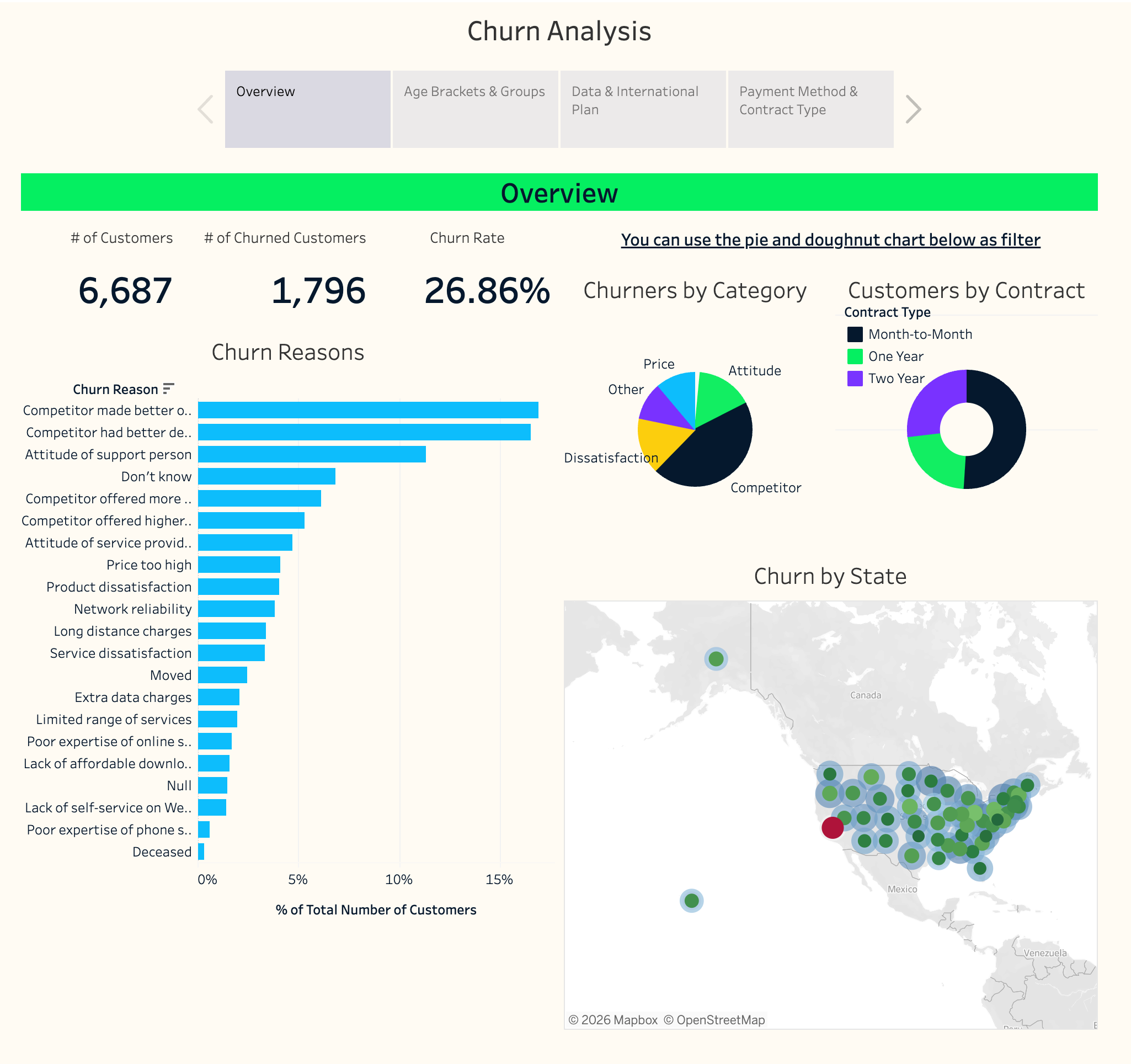
Tableau dashboard exploring churn by contract, usage, age, and geography.
What I looked at
The overall churn rate was 26.9%, but that number alone didn't say much about who was actually leaving.
I broke the data down by contract type, payment method, service usage, age, and location to see where the differences were largest.
What stood out
The biggest difference was international-plan usage.
Customers who paid for an international plan but never used it had about 71% churn.
Customers who had the same plan and actually used it had about 7.6% churn.
The data doesn't explain why that difference exists, but it gives a specific group to investigate.
A large share of churn also sat in one contract and payment group.
Month-to-month customers using direct debit accounted for 1,141 of the 1,796 customers who churned in the dataset.
That made the group worth looking at even though its churn rate wasn't the highest.
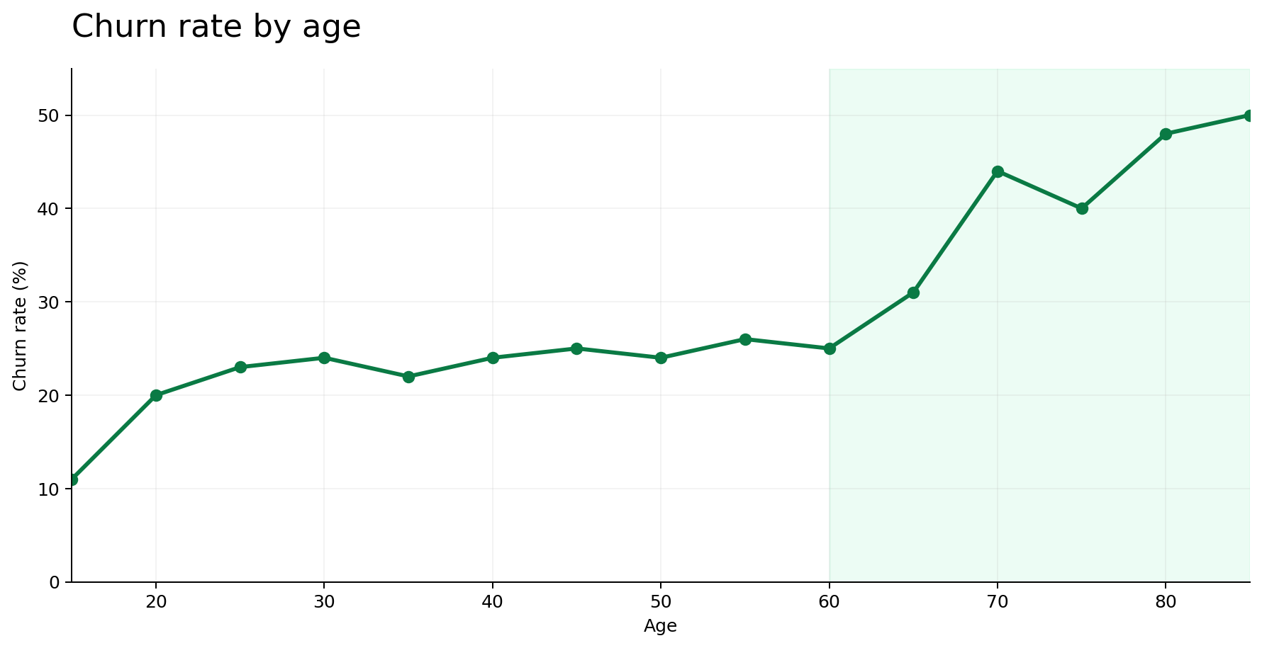
Age showed another pattern.
Churn stayed relatively stable through much of the age range and then increased among customers over 60, reaching close to 50% in some of the oldest groups.
I would treat that as a group worth investigating further, not as a precise age cutoff.
Next steps
What I would look at next
I would start by testing whether customers with unused international plans are on the wrong plan or aren't seeing enough value from it.
I would also look closely at month-to-month customers using direct debit, since that group accounts for 1,141 of the 1,796 churned customers in the dataset.
The original analysis included a scenario where churn falls to roughly 18–20%, but that was a planning estimate, not a measured result.
Reflection
What I learned
This was one of my first analytics projects, and it was guided.
What stuck with me was how little the overall churn number told me until I started breaking it into smaller groups. The useful part wasn't the 26.9% by itself. It was seeing how different the picture looked once I compared customers by how they paid, what they used, and the contracts they were on.