HIGHER EDUCATION · PUBLIC DATA

Program Viability Assessment

I built an end-to-end analysis around a question Vanderbilt could realistically face: which new online graduate programs should it consider launching next?

Context Self-started project inspired by a Vanderbilt Data Analyst role
Tools PostgreSQL · SQL · Python · Tableau · Claude Code · Firecrawl · Composio
Data IPEDS · BLS · NCES · Vanderbilt catalog
Project type Program viability analysis

Overview

Vanderbilt already offers a range of online graduate programs. I wanted to explore how public data could help identify where there might be room for another one, using both student demand and labor-market demand as evidence.

That meant answering a few questions before I could rank anything: What programs should even be considered? How do I connect a field of study to the occupations it can lead to? How do I compare metrics measured on completely different scales? And once I have a ranking, how much of the decision can the data actually support?

An early AI-assisted planning pass jumped straight to a list of 12 possible programs. I rejected that as the candidate set. The analysis was supposed to derive the possibilities from the data rather than start by validating ideas chosen in advance.

After the source data was collected, cleaned, connected, and checked against Vanderbilt's existing catalog, I had 1,254 eligible fields of study to evaluate. That scored population came from a 1,268-row analysis mart after excluding the 14 CIP rows Vanderbilt already offers.

Candidate, on this page, means a potential graduate program idea represented by a field of study in the analysis. It does not mean a person or applicant.

From there, the problem became: how do I compare 1,254 very different possibilities in a consistent way?

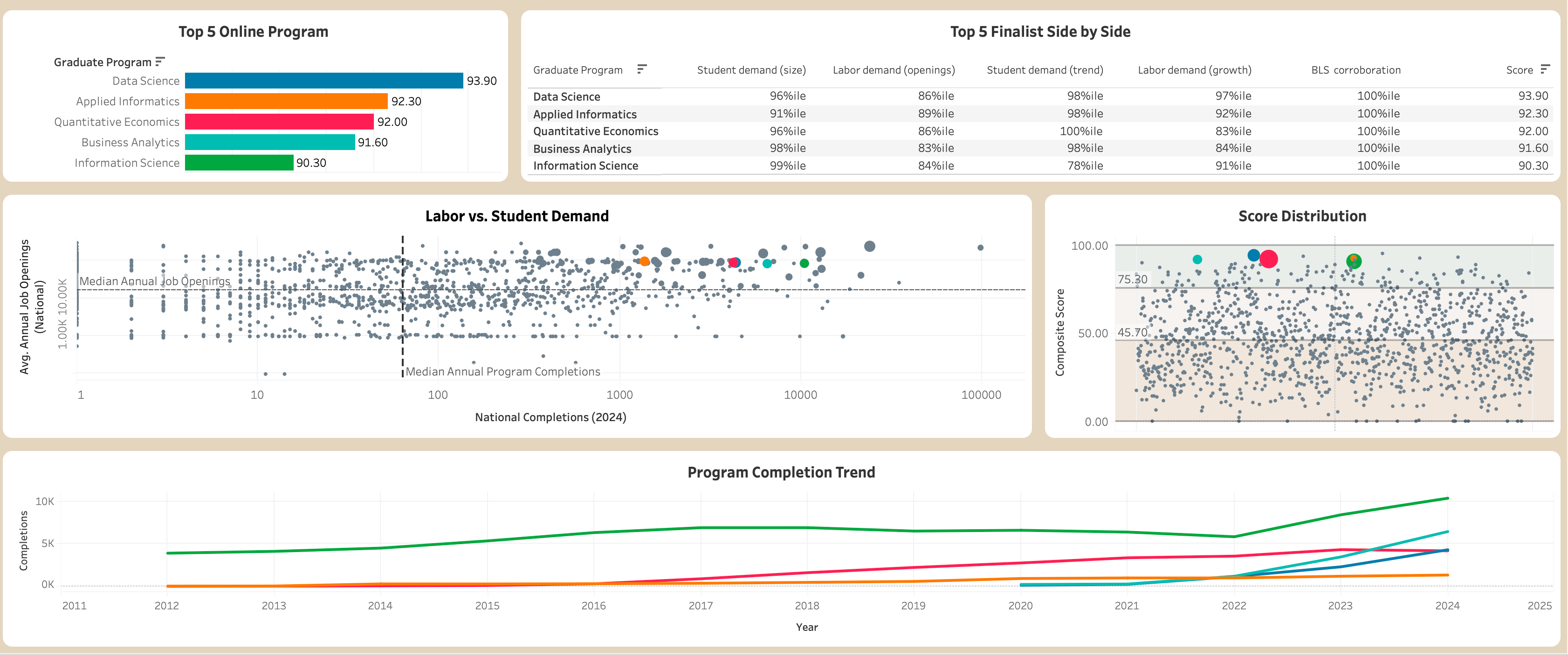
Authentic Tableau dashboard header showing the High-Impact Online Graduate Program Opportunity Overview, composite score, annual job openings, program completions, and projected employment growth. Authentic Tableau dashboard body showing the top five online programs, finalist comparison, labor versus student demand, score distribution, and completion trend.

The final dashboard brought the score, finalist comparison, labor demand, and completion trends into one view. This is the original project visual, with its Tableau colors preserved.

Designing the score

I needed one measure that could bring several kinds of evidence together.

The final composite score used five signals. The two largest weights went to current student demand and current labor demand. Growth measures added direction, while the BLS flag acted as supporting evidence rather than dominating the score.

Missing data also needed a rule. If a program was missing one of the five metrics, I did not automatically treat the missing value as zero. The score used the metrics that were available and redistributed the missing weight proportionally across the remaining metrics so the row still summed to a 100-point scale.

I also kept n_metrics_used alongside the score. A result backed by three or four metrics remained visibly different from one backed by all five instead of being hidden behind a clean-looking number.

30% Current student completions
30% Employment-weighted annual job openings
15% Completions growth
15% Employment-weighted job growth
10% BLS top-30 labor list

Five signals · weights sum to 100% · available metrics are rescaled when one is missing

Making unlike metrics comparable

Before combining the metrics, I had to put them on a comparable scale.

That became a real issue when I looked at the distributions. Business Administration, for example, had 97,150 completions, while the median field had only 64.5. With min-max normalization, an extreme value like that would define the upper end of the scale and compress most of the remaining fields close to zero.

97,150Business Administration · completions
64.5Median field · completions

Same measure, same axis. The median bar is technically present at 0.067% of the outlier's value, which is why min-max scaling would flatten most fields.

Min-max scaling

Easy to explain, but too sensitive to the extreme values in this dataset.

Capping or winsorizing

A reasonable alternative, but it introduces another decision about where the cap should be.

Percentile rank

Ranks each field relative to the candidate pool, so one extreme value cannot stretch the whole scale.

I chose percentile rank and used the same method across all four continuous metrics. The tradeoff is that percentile rank preserves relative position rather than the size of the gap. I was comfortable with that because the score was being used to prioritize programs for further review, not to claim that a 90th-percentile field was literally twice as attractive as a 45th-percentile one.

Connecting education to the labor market

IPEDS describes fields of study using CIP codes. BLS describes occupations using SOC codes. Those systems do not join directly, so I used the NCES CIP-to-SOC crosswalk to connect them.

The difficult part was that the relationship is many-to-many. A program can map to several occupations, and some fields connect to a very large number of SOC codes.

Using every occupation could exaggerate labor demand. Picking only one could make a multidisciplinary program look much narrower than it really is.

I settled on the top three occupations by 2024 employment for each field and combined their labor metrics using an employment-weighted average. That gave each candidate more than one plausible career path without allowing a long tail of weak occupational matches to dominate its labor score.

01CIP fieldIPEDS field of study
02NCES crosswalkCIP to SOC mapping
03Top 3 SOC occupationsBy 2024 employment
04Weighted labor metricsOpenings and growth

Narrowing 1,254 possibilities

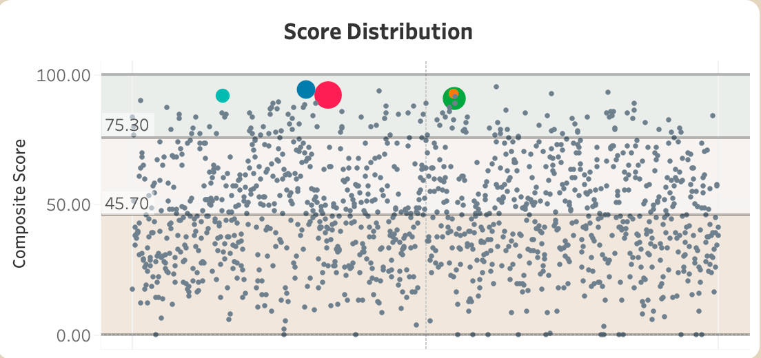
Once the composite scores existed, I looked at the actual score distribution before setting any thresholds.

The distribution had no natural break, so I used a named rule rather than inventing a cutoff around a convenient-looking number. Go is the top decile, the p90 band, at score ≥ 75.3. Test covers scores from 45.7 to 75.2. Pass is anything below 45.7.

Authentic score distribution figure with verified horizontal boundaries at 75.30 and 45.70, and the five finalists highlighted above the Go threshold.
Locked p90 (75.3) and median (45.7) boundaries, plotted from the actual scored candidate rows.
Data ScienceApplied InformaticsQuantitative EconomicsBusiness AnalyticsInformation Science
Min 0Median 45.7p90 75.3p95 82.8Max 95.1

Pass

626

<45.7

Below the median score eligible candidates

Test

502

45.7 to 75.2

At or above median, below p90 eligible candidates

Go

126

≥75.3

Top decile, at or above p90 eligible candidates

That produced 126 Go · 502 Test · 626 Pass. The Go band became the working shortlist. I then grouped related CIP fields before choosing final programs, reducing duplicate ideas while keeping the underlying scores and specific fields available for inspection.

What stood out in the shortlist

The score narrowed a very large search space into something I could actually inspect. It also exposed places where the underlying data mattered more than the ranking alone.

Caveat in the ranking

Management Science 95.1

One of its strongest labor signals came through the broad General and Operations Managers occupation. I had already flagged that occupation as a potential source of inflated labor demand, so I carried the caveat into the shortlist instead of hiding it inside the composite score.

Catalog check

Nursing cluster removed

I had already left the Nursing cluster out of Go and Test. Midway through the project, I realized Vanderbilt already offers Family Nurse Practitioner as a specialty within its existing Master of Science in Nursing. I removed the cluster then and documented the catalog limitation.

Where I landed

Five programs remained at the top of the final shortlist. Data Science ranked first, but the scores are close enough that I would treat them as a priority set for deeper feasibility work, rather than claim the model alone determines what Vanderbilt should launch.

01 Data Science 93.9
02 Applied Informatics 92.3
03 Quantitative Economics 92.0
04 Business Analytics 91.6
05 Information Science 90.3
82Composite score · 82 to 100100

The next stage would bring in information this project does not have: faculty capacity, curriculum overlap, competitor programs, pricing, enrollment economics, and the likely academic home for each program.

The value of the model is that Vanderbilt would not have to investigate every possible field equally. It provides a reasoned place to start.

How I built it

The project went from public source collection to a stakeholder-facing recommendation.

I used Python for collection, cleaning, and verification, PostgreSQL for the analytical pipeline and scoring logic, and Tableau for the final dashboard.

The pipeline covered source collection and cleaning, CIP-to-SOC mapping, the one-row-per-program analysis mart, employment-weighted labor metrics, percentile normalization, the five-part composite score, Go/Test/Pass bands, shortlist preparation and clustering, dashboard extracts, and final visualizations.

I used Claude Code, Firecrawl, and Composio throughout the workflow for collection, implementation, research support, and repetitive mechanical tasks.

For decisions that could change the result, I checked the underlying data before carrying them forward. I independently recomputed the reported distributions and normalization results against the analysis mart before approving the percentile method and final weights. All 21 checks reproduced the reported results.

01Collect / clean
02PostgreSQL mart
03Scoring / shortlist
04Tableau / report / deck

Working with AI

This was also one of my first projects where AI was part of the workflow from beginning to end.

I used it heavily across the workflow. No single agent handled the entire analysis. Different tools and models were better suited to different pieces of the work. Some helped with scraping and repetitive implementation. Others were more useful when I needed to reason through a method, critique an approach, or explain something I was learning.

There were several moments where an AI-generated answer looked reasonable and turned out to be wrong after I checked the source.

For example, an automated matching approach gave confident CIP-code suggestions for Vanderbilt's existing programs. When I checked those assignments against Vanderbilt's official Registrar list, 4 of the 11 high-confidence matches were wrong.

That changed how I used AI during the rest of the project. Confidence from the model became one input. I still needed to check the evidence myself.

Reflection

What I took from the project

This project gave me a much better sense of what end-to-end analysis actually involves.

The SQL and Tableau work mattered, but a lot of the harder decisions happened before or around the code: deciding what one row represented, connecting two classification systems, choosing how to normalize skewed metrics, deciding what belonged in a composite score, and working out what to do when a strong result carried a known caveat.

I also used the project to pay attention to how I was using AI itself. Model capability is only one part of that decision now. Cost, token usage, context size, speed, and the amount of supervision a model needs all affect whether it is actually a good choice for a task.

I started keeping track of which kinds of work benefited from stronger reasoning models and which could be handled just as well by cheaper or faster ones. I also became more deliberate about splitting work into focused sessions instead of carrying a huge amount of context through every step.

I have not turned that into a formal benchmark yet. I want to write about it later: which models worked best for which kinds of tasks, where the costs showed up, and how I would manage an AI budget across a similar project. When that article exists, I'll add it here as a related piece.